ReacType 5.0: Prototype your React applications without writing a line of code

WHAT IS REACTYPE?
ReacType is a prototyping tool that enables new and seasoned developers to build React components via a drag-and-drop interface and visualize in real time how their components are being constructed in a code preview window. These instances of React components can then be exported as starter templates that serve as the foundation of React applications, including those utilizing the Next.js and Gatsby.js frameworks. ReacType can be thought of as the helper who creates blueprints on-the-go, allowing developers to dive straight into coding with a skeleton of styleable components, thus streamlining the configuration process for application development.
HOW DOES IT WORK?
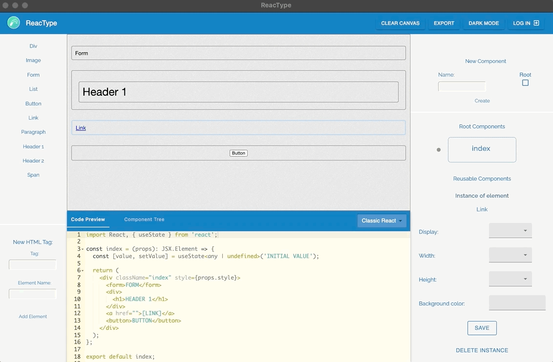
Development begins when a single React component or HTML element is dragged onto the canvas. Users are able to nest certain items within one another, create multiple instances of components, and edit the code that is being generated dynamically. In addition to the canvas and code preview, ReacType provides a third visualization tool in the component tree, as it depicts the parent-to-child relationship of the components on the canvas. Controls that modify such components, including a “Save” feature for element styling and a “Delete Instance” button, are also available a click away. When work needs to be paused, registered users can save their projects — the components they have built — in a database and come back to them at a later time. When the projects are complete, the corresponding code in the preview window can be exported and transported to an IDE of choice. ReacType thus expedites development by distilling the task at hand: Instead of building an entire application at once, users can nimbly form one component at a time and deploy it in a new or an existing codebase in minutes.
NEW FEATURES IN REACTYPE 5.0
- In addition to classic React and Next.js application files, React components can now be prototyped and exported in Gatsby.js.
- React components can be constructed from both top-down and bottom-up.
- UI/UX revamp integrates universal design sensibilities for web applications.
FUNCTIONALITY ENHANCEMENTS
ReacType 5.0 contains two major functionality enhancements.
First, users may prototype pages in Gatsby.js syntax, in addition to the classic React and Next.js syntax previously available. Developers looking to prototype smaller projects implementing server-side rendering and other Gatsby features can take advantage of this addition.

Second, components now may be constructed in any order, rather than only from top to bottom. Previously, users could add HTML elements and other facets of components only to the end of a component or a div within that component:

In ReacType 5.0, the user can insert elements anywhere in a component or a div — and this includes the ability to move previously added elements, enabling the user to restructure components on the fly.
UNDER THE HOOD
To permit users to place elements anywhere in a component or a div, ReacType now includes invisible elements called “Separators.” Separators are automatically placed on the canvas before every visible element. When the user drags an element over a Separator, the Separator is highlighted to show that it is a suitable drop location. When an element is dropped into a Separator, that Separator is replaced by the visible component, and a function ensures that Separators appear in their proper locations in the modified component. To prevent inadvertent movement of Separators, ReacType does not allow the user to move or select them. Additional functions ensure that Separators do not appear in the code preview window or in the component tree, and Separators are similarly omitted from exported components. As a result, Separators integrate seamlessly with the existing user experience, providing additional functionality without increasing complexity of use.
UI/UX DESIGN
With the implementation of React dnd (drag-and-drop), ReacType paved the way toward a user-friendly focus. Version 4.0 delivered an Electron-based desktop application organized into four main sections: left, right, main, bottom. While Version 5.0 kept the application structure mostly in place, Version 5.0 engineers questioned how far “user-friendliness” could go.
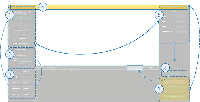
Version 5.0 welcomes users with a refreshing blue-and-light-gray color scheme, where each section is discretely organized by functionality. With the latest addition of the navbar at the top of the page, ReacType 5.0 aggregates the administrative functionality that affects the entire interface — clear canvas, export, dark/light mode, and login buttons — to the top right. The left panel governs HTML elements that can be dragged onto the canvas at the central, main portion of the application. The right panel hosts reusable components that users can also drag and drop onto the canvas. Code preview and the component tree remain in the bottom panel, simplified to have one color theme for the code preview window and a dropdown menu to switch among classic React, Next.js, and Gatsby.js syntax. The new interface improves the user experience by revising the location of core functionality to allow users to find and navigate page contents more intuitively. Subsequently, users are able to accelerate their component-building and move on to implementing the next feature.
But wait, how did we arrive at this UI?
There was much deliberation behind the selection of colors, placement of buttons, and the relationship of functionality adjacencies. On top of that, ReacType 5.0 seeks to bring the joy and ease of creating functional React applications to a wider audience through the lens of universal design. One thing to note: Version 5.0 reflects one way of interpreting and addressing the principles of Perceivable, Operable, and Understandable from Web Content Accessibility Guidelines (WCAG) 2.1. WCAG defines these principles as the following:
- Perceivable refers to sensory, whether users are able to perceive the information in which it is being presented.
- Operable determines whether components on the interface are operable and users can navigate the site.
- Understandable evaluates whether text on a page is legible and can be understood.
In response, ReacType 5.0 first carefully considered its use of color. Shades of green or red were replaced to accommodate deuteranopia and protanopia. Furthermore, the foreground and background color schemes in both light and dark modes comply with WCAG’s contrast ratio requirement of 4.5:1. WCAG measures contrast by the perceived luminance between two colors. As a frame of reference, white text on a white background would yield a ratio of 1:1 and black on white a ratio of 21:1. ReacType’s ratios offer users a comfortable level of contrast with reduced glare.
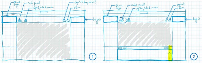
Instead of adding heaps of new features, ReacType 5.0 focused on editing the existing interface. As mentioned above, the interface underwent some restructuring to assist users in finding desired content more easily, but no new buttons were created in the process. Although the navbar can be seen as an addition, it truly serves as a container to hold existing buttons that were relocated. Of the four buttons, it was critical for “Clear Canvas” to be adjacent to the canvas. Draggable components and HTML elements were moved to either side of the canvas to minimize travel distance. Miscellaneous features, such as the dropdown menu to change the theme of the code preview, were benched, as they had little impact on driving the application’s original intent. Finally, icons next to the headings at each draggable HTML element were removed and replaced by a hover effect to strengthen the overall consistency in the buttons’ styling and content clarity.
Without understanding the target audience’s needs, it is easy to reduce design to merely “styling” or making a button look more aesthetically pleasing. ReacType 5.0’s facelift goes far beyond cosmetics; its focus is human-centric design that enhances how the application functions intimately at a macro- and microscale.
WHY DO WE CARE?
According to the World Wide Web Consortium (W3C) — an international organization founded by Tim Berners-Lee — web accessibility refers to any user’s experience to view a site’s content and operate its functionality. It might be common to assume that every user interacts with a page’s content in the same way as the next user. Just because someone can see, however, he or she may not necessarily be able to perceive the contents of a page. Web accessibility affects the population living with any form of limitation, not restricted to auditory, cognitive, neurological, physical, or visual. It also supports social inclusion for users of older age groups and those who live in developing countries or rural areas. In fact, one in four adults in the United States lives with some type of disability, and two in five adults age 65 or older are predicted to have a disability at some point in their lives (see further reading *).
For developers, creating websites, tools, and technologies from another user’s experience will most likely benefit the able-bodied as much as those living with disabilities. Effort also needs to be invested in testing and inspecting, for example, features of an application, so that they can be improved and respond appropriately to users. A webpage with a clear layout and consistent styling offers ease of navigation that is desirable for users of all abilities.
GET INVOLVED
Where can I get my hands on the app? We are always looking to improve and would love to hear from you! Download ReacType on Github, submit any issues, or contribute to the open-source project. Visit the website for more information.
ReacType 5.0 engineers and co-authors:
- Luke Madden, Github | Linkedin
- Linh Tran, Github | Linkedin
- Alex Wolinsky, Github | Linkedin
- Yu Ting (Julie) Wu, Github | Linkedin
FURTHER READING
Contrast and Color Accessibility: Understanding WCAG 2 Contrast and Color Requirements. (2021, January 9). Retrieved from https://webaim.org/resources/contrastchecker/.
Design & User Experience: Accessibility. (2019, September 3). Retrieved from https://developers.google.com/web/fundamentals/accessibility.
*Disability Impacts All of Us. (2020, September 16). Retrieved from https://www.cdc.gov/ncbddd/disabilityandhealth/infographic-disability-impacts-all.html#:~:text=61%20million%20adults%20in%20the,Graphic%20of%20the%20United%20States.
May, M., & Chisholm. W. (2008, November 14). Universal Design for Web Applications: Web Applications that Reach Everyone. O’Reilly Media.
User Agent Accessibility Guidelines (UAAG) 2.0. (2015, December 15). Retrieved from https://www.w3.org/TR/UAAG20/#gl-keyboard-access.